Another IH logo in These titles mean nothing.

  • May 10, 2017, 1:03 p.m.
  • |
  • Public

alt text

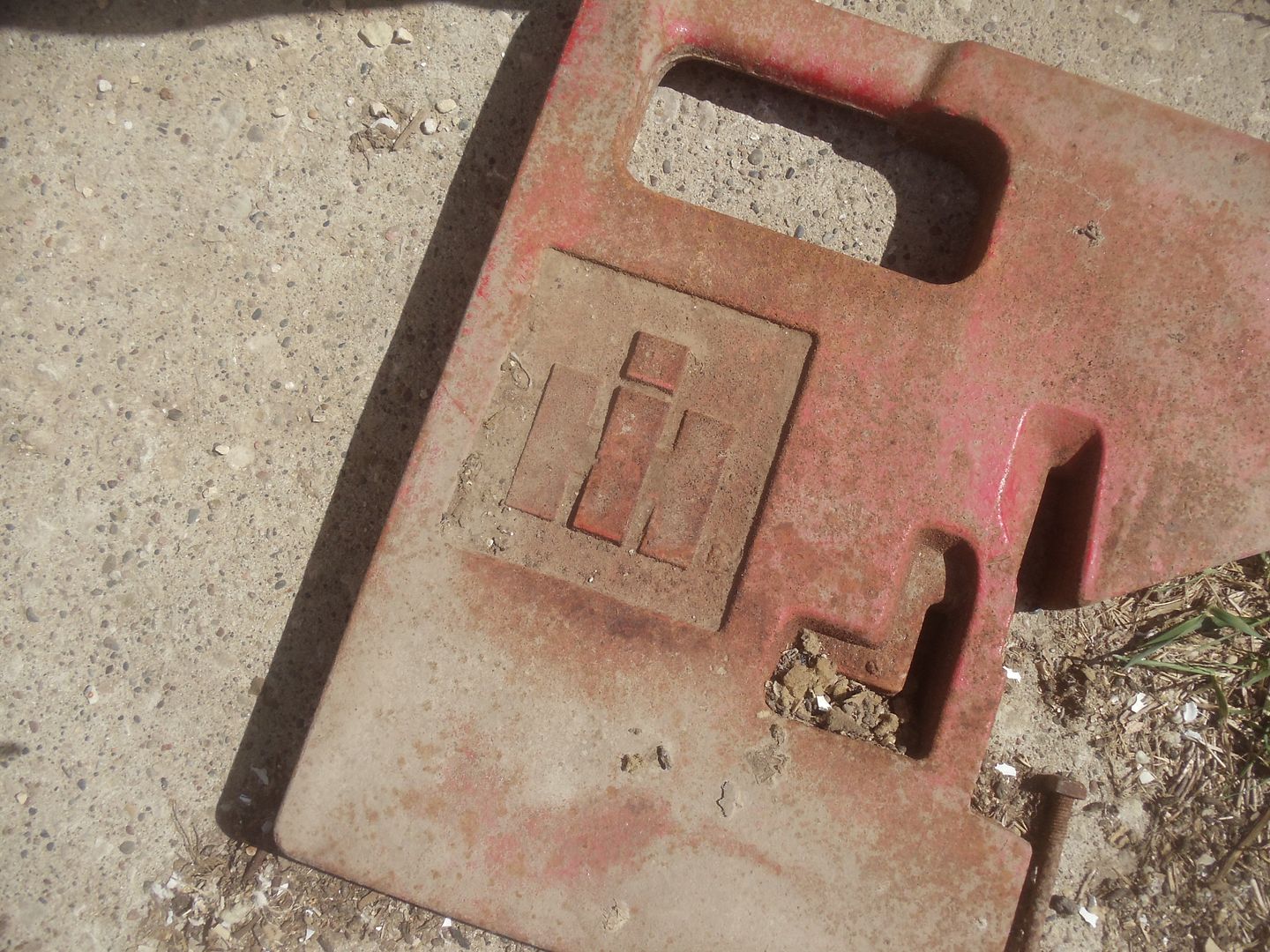
This is a weight for the front end of a tractor. The two cab tractors and the 1256 all have brackets on the front from which to hang weights. We have almost a dozen of them. They each weigh a hundred pounds. We don’t use them much, never on the cab tractors and rarely on the 1256 when it disks.

IH has a really nice logo. The I is on top of the H so that the H’s legs look like tractor wheels and the I with a dot on top is the body of the tractor and the head of the driver. Raymond Loewy was the designer. Look him up. He is also famous for train locomotives and Coco Cola vending machines.

=========================================

I keep thinking I’m going to write a bunch of stuff but then when the time comes I don’t.


Deleted user May 10, 2017

That was interesting though !

NorthernSeeker May 10, 2017

I'm guessing that the weight is used to improve traction in slippery conditions...kind of like throwing bricks into the back of a rear wheel drive vehicle? There is a lot of art in industrial designing.

woman in the moon NorthernSeeker ⋅ May 10, 2017

Yes, weight in front holds the front of the tractor down when it's pulling. It's funny but the word tractor means to pull and that's what it does.

woman in the moon NorthernSeeker ⋅ May 10, 2017

At tractor pull competitions, the classes are by weights of the tractors. When they go to a higher weight class, they add weights. Tractors also have wheel weights on the big back wheels.
My dad would tell us kids to 'sit heavy' in the back seat when he was trying to get the car up the big hill on the way to church on Sundays.

Brakeshoe Bob May 10, 2017

Raymond Lowey and Otto Kuhler were pioneers and way above their time in Steam Power design. Otto Kuhler also did water painting on Railroad Subjects My favorite South Park Ground Blizzard, true narrow gauge, Ranchers, Life in that time.

noko May 12, 2017

Wonderful post. Thank you.

Serin May 14, 2017

I'm amazed at the care and depth of thought that goes into a logo sometimes. and the tractor profile is brilliant.

By contrast, a prior employer spent 25 million dollars with a design company and the result was a semi circle of dots that was supposed to represent the multitude of customer relationships. Yet, everybody I talked to called it "The Coffee Stain."

WhatDreamsMayCome May 17, 2017

I'll take quality over quantity any time.

You must be logged in to comment. Please sign in or join Prosebox to leave a comment.